The mortgage spread: what 55 years of data says about your rate
Educational overview. Not individualized financial, legal, or tax advice. How we source and check numbers.

Almost every explanation of mortgage rates points at the Federal Reserve. So we went and measured it. Across 2,897 weeks of data going back to 1971, the gap between the 10-year Treasury and the average 30-year mortgage turns out to explain more of what borrowers pay right now than the Fed does, and that gap is currently well above its historical norm.
The finding
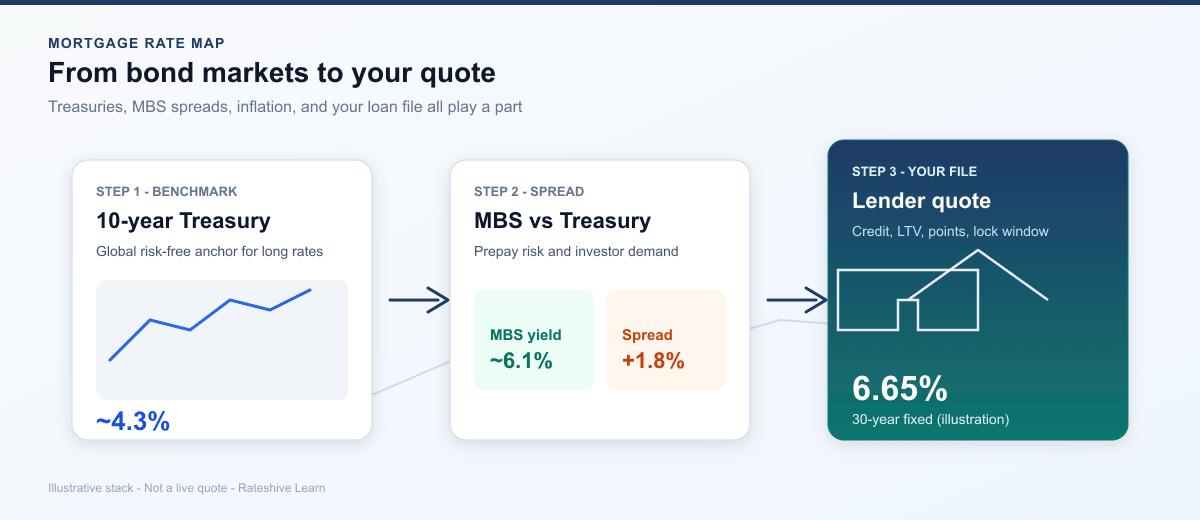
In the week ending October 1, 2026, Freddie Mac's survey average for the 30-year fixed was 7.28% and the 10-year Treasury yield was 5.24%. The difference, what the industry calls the spread, was 2.04 percentage points.
From 1990 through 2019, that spread averaged 1.66 points and never once exceeded 3.11. Today's 2.04 is roughly 0.38 points above that long-run norm. Nothing about that 0.38 has anything to do with Treasury yields, inflation, or the federal funds rate. It is the price investors are currently charging to hold mortgage risk specifically.
On a $400,000 loan, that excess is not academic. At 7.28% the principal and interest payment is $2,736.85. At 6.90%, which is what the same Treasury yield would have produced at the 1990 to 2019 average spread, it is $2,634.40. The difference is $102.45 a month, about $8,600 over seven years and roughly $36,900 across a full 30-year term.
Data and method
We used two public series from the Federal Reserve Bank of St. Louis. MORTGAGE30US is Freddie Mac's Primary Mortgage Market Survey average for the 30-year fixed, published weekly on Thursdays since April 2, 1971. DGS10 is the 10-year Treasury constant maturity yield, published daily.
For each of the 2,897 PMMS observations we took the most recent Treasury yield on or before the survey date, since PMMS publishes on Thursdays and the Treasury series skips market holidays, then subtracted one from the other. That produced 2,897 matched weekly spread observations covering April 1971 through October 1, 2026. No smoothing, no interpolation, no seasonal adjustment.
The script that pulls the series and reproduces every number on this page is
scripts/fred-spread-research.mjs in our repository. The underlying data is free and the endpoints
require no key, so you can verify any figure here yourself.
Result: the spread is not a constant
The single most common simplification in rate commentary is that mortgages run "about 1.7 points over the 10-year." That is a fair description of the long-run average and a poor description of any particular year.
| Period | Weeks | Mean | Median | Range |
|---|---|---|---|---|
| Full series, 1971 to 2026 | 2,897 | 1.77 | 1.67 | -0.03 to 5.66 |
| 1990 to 2019 | 1,565 | 1.66 | 1.62 | 0.97 to 3.11 |
| 2020 to 2021 | 105 | 1.86 | 1.72 | 1.28 to 2.72 |
| 2022 to present | 248 | 2.43 | 2.45 | 1.49 to 3.26 |
| Last 52 weeks | 52 | 2.00 | 1.98 | 1.81 to 2.28 |
Two things stand out. The 2022-onward era averages 2.43 points, nearly three quarters of a point above the 1990 to 2019 norm, and its floor of 1.49 is barely below the older period's average. For four years, borrowers have been paying a persistent premium that no Treasury chart would reveal.
The last 52 weeks average 2.00 with a tight range of 1.81 to 2.28. That is meaningful improvement from the worst of the post-2022 period, and still above normal. The spread has been compressing, slowly.
Result: the extremes are larger than most people assume
The widest spread in the series was 5.66 points, in the week ending May 2, 1980, when the survey average was 15.90% against a 10-year yield of 10.24%. The narrowest was negative 0.03 points, on February 22 of the same year, when the 30-year mortgage average of 13.03% sat fractionally below the 10-year yield of 13.06%.
Those two observations are eleven weeks apart. Whatever the spread is, it is not a stable structural constant, and in genuinely disorderly markets it can do almost anything. For context, the series high for the mortgage rate itself was 18.63% in October 1981 and the low was 2.65% in January 2021.
Interpretation: what the spread is actually paying for
A Treasury bond pays a known amount on a known schedule. A mortgage does not, and the spread is compensation for the three ways it differs.
Prepayment risk is the big one, and it is asymmetric in a way that works against investors. If rates fall, borrowers refinance and the investor's high-yielding bond disappears exactly when reinvesting is least attractive. If rates rise, borrowers stay put and the investor is stuck holding a below-market asset. Heads they lose a little, tails they lose a little. When rate volatility is high, that option is worth more, and the spread widens.
Who is buying matters at least as much. Through the 2010s the Federal Reserve was a very large purchaser of mortgage-backed securities, and banks were also accumulating them. Both stepped back after 2021, which removed persistent demand from the market. Fewer buyers for the same supply means sellers accept a lower price, and a lower price on a bond is a higher yield, which is a wider spread. This is the most credible single explanation for the post-2022 shift visible in Table 1.
Credit and servicing costs make up the remainder, and they are the most stable component.
What this analysis does not show
Honesty about limits is what separates a measurement from a forecast, so here is what we cannot claim.
This does not predict anything. We measured a historical relationship. The spread was above its norm for four years and could stay there for four more, or compress next quarter. Nothing in this dataset tells you which.
PMMS is a survey, not a transaction record. It reflects rates lenders say they are offering to well-qualified borrowers with a conventional conforming loan and roughly 20% down, traditionally with points paid. It is not a volume-weighted average of closed loans. A lock-based index such as OBMMI answers a different and sometimes more current question, which we cover in OBMMI vs PMMS.
The 10-year Treasury is a convenient proxy, not the true benchmark. Mortgage pricing tracks a blend of yields reflecting expected loan life, which historically behaves more like a 7-year horizon than a 10-year one. Using DGS10 is standard practice and keeps the analysis reproducible, but it introduces a small, consistent bias to the level of the spread. Era-over-era comparisons are unaffected because the bias applies throughout.
A spread is not a quote. Everything here describes the market layer. It says nothing about what any individual borrower is offered.
The layer this does not reach: your file
The market sets the backdrop. Your application sets the final number, and the gap between two borrowers on the same day can rival the entire post-2022 spread anomaly.
Take the October 1 survey average of 7.28% and two applicants wanting the same $360,000 loan. A borrower with a 760 score, 20% down, and a primary residence might be quoted near par. A borrower with a 680 score and 5% down, same property type and lock window, would typically be quoted a quarter point higher and carry mortgage insurance. Same market, same week, different risk price.
Lenders adjust for credit band, loan-to-value, loan size, property and occupancy type, points or credits, and lock length. Of everything discussed in this article, this is the only layer you control. Our credit score and your quote guide covers the largest of those adjustments.
What a borrower should take from this
The practical conclusion is narrower than the usual advice, and more useful. If you are waiting for rates to improve, the thing to watch is not the Fed's next meeting. It is whether the spread keeps compressing, because roughly 0.38 points of today's rate is spread premium rather than Treasury yield, and that portion can unwind without any change in Fed policy or inflation.
It also means that comparing your quote against a headline average is close to meaningless unless you know the headline's assumptions. The survey and your Loan Estimate are measuring different things.
And the layer worth your actual effort is the one you can move. Spread compression is not something you can influence or time. A higher credit score, a lower loan-to-value, and three competing written quotes are.
Reproducing this
Both series are free from FRED and need no API key. Pull MORTGAGE30US and DGS10, align each weekly survey date to the nearest prior Treasury observation, and subtract. We re-run this when we update the page, and the revision date in the byline reflects the last time the figures were refreshed.
If you find an error in our arithmetic or our method, tell us through contact and we will correct the page with a dated note. Our sourcing rules are on the methodology page.
Data retrieved October 4, 2026 from FRED MORTGAGE30US (Freddie Mac Primary Mortgage Market Survey) and FRED DGS10. Spread figures are our own calculation. Educational analysis only, not lending advice, and not a forecast.